
We took JouleBug's core behavioral change experience and redesigned it to make it more intuitive and easier to navigate.
My Contributions
Visual + Interaction Design
Product Management
Creative Direction
Information Architecture
April 2015
the Challenge
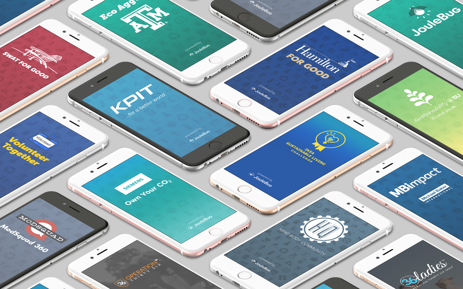
The JouleBug mobile app's core experience is all about logging or 'Buzzing' sustainable actions that users do in real life. JouleBug's customer organizations are able to customize the app's actions to encourage their members to act sustainably.
In an effort to motivate users by applying gamification techniques to mundane tasks, early versions of JouleBug had put an emphasis on turning every action into highly stylized achievements. As the content expanded, we continued to rely on achievements as both a hierarchy and navigation structure. This resulted in an experience that checked all the boxes of desired functionality but was not meeting expectations for users or customers.

The 'Before'
Research & Approach
Early sketches.
We interviewed existing users and customers which revealed three key pain-points that we chose to focus on:
- Users found the actions cryptic. Users needed to read several sentences for each action, just to be able to understand what it was.
- Users were overwhelmed. Too many choices and a confusing hierarchy caused them to not know where to start.
- Customers needed simpler ways to customize actions, each requiring significant creative input for each customization.
It became clear that to properly solve these issues, we would need to revisit the section's organization from the ground up.
Early wireframes exploring different navigation and content hierarchies.

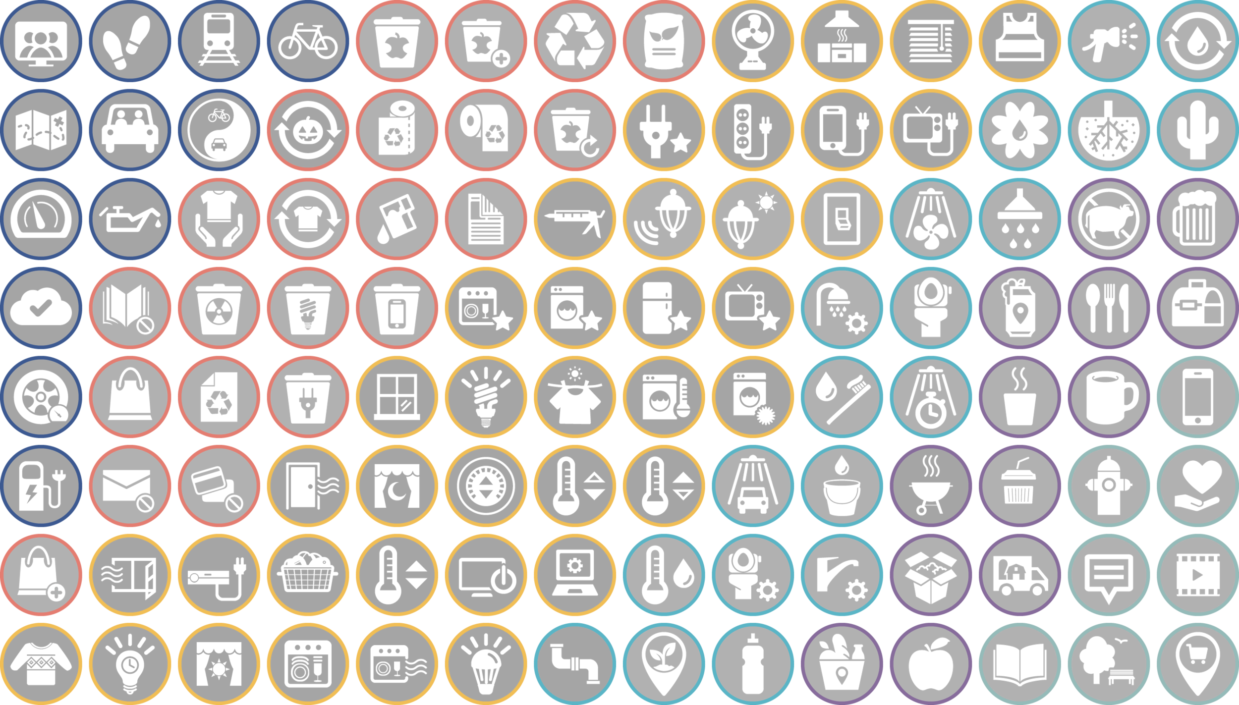
The new Action design uses universal design and color coding based on categories.
Immediate Recognition
In order to encourage users to browse more actions, we needed to decrease the amount of effort required to understand what each action represented. This meant simplifying the visual design of the actions as a whole.
We chose to ditch the highly stylized 'Pin' design in favor of universal design inspired icons for immediate comprehension. We added color coding for the achievement ring to visually associate similar actions. We bolded key words in each action's description to make skimming easier. All of this added up to easier comprehension and faster browsing.
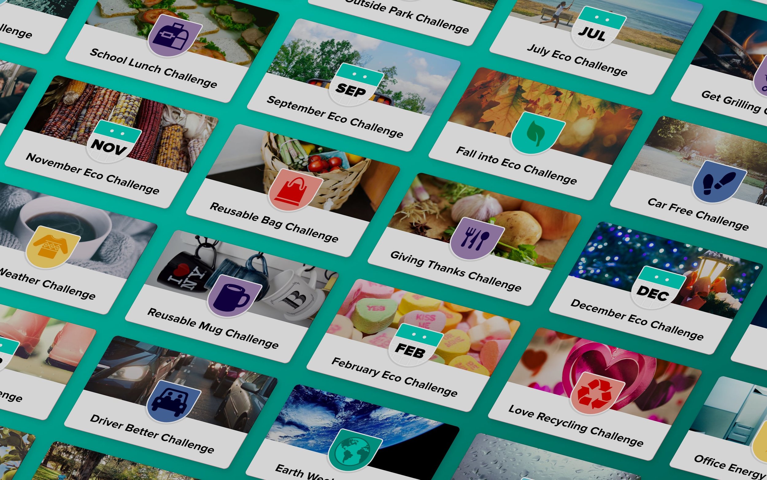
Organized for Discovery
We reorganized the action section navigation into a category system based around real-life experiences, such as Food & Drink, Shopping, or Transportation. This change was optimized for several dominant use cases:
For new users, or those needing suggestions, the default 'Featured' category uses an algorithm to recommend the best Actions based on factors like a user's history, location, and time of day.
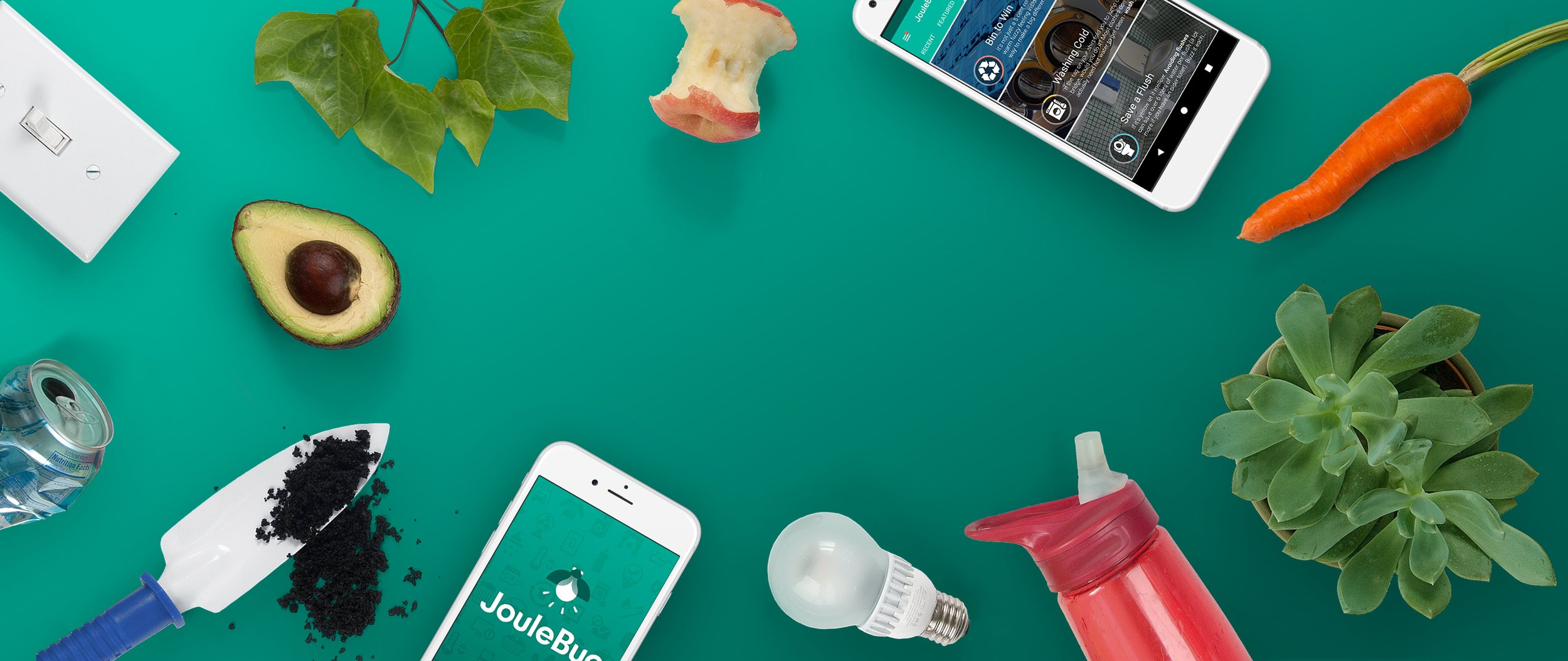
For those that want to discover new actions, we paid close attention to the details of the browsing experience. We added colorful cover photos for each action, and used gestures and custom transitions that were both delightful and reinforced the new hierarchy.
For users that frequent the same set of actions, the 'Recent' category is one quick swipe from the default 'Featured' category.
Localizing for Customer Initiatives
As we restructured actions, we paid attention to customers' needs for customization options. Early iterations of JouleBug required customers to create their own unique achievements. This caused redundancy for users, and significant costs for customers.
We designed customizations to build upon existing actions, instead of duplicating them, and to do it with minimal effort. This can be seen in the shift toward universal design iconography and background photos, both of which can be generated quickly without compromising experience. We also created slots to highlight educational content that customers had already created for their existing initiatives, like instructional webpages and videos.

Results
As a result of the redesign, we had shifted the core Buzzing experience away from its focus on achievement advancement, and refocused it on the action itself. This shift encouraged more social sharing, creating a virtuous cycle of inspiration and encouragement.
Shortly after this redesign was launched, JouleBug was featured by the editors on the App Store as part of their Earth Day promotion. While the app has been updated continuously since its launch, the core principles of this redesign can still be experienced in the iOS and Android version today.
Real Actions logged in JouleBug (identities have been modified for privacy).
“Makes me want to change the world! Would recommend to everyone.”
“Great to see such a great quality built app that is encouraging good things.”
More Projects
Making Sustainability Fun
Better Habits Through Competition
Taking Control
Making it Yours