MY Contributions
Visual + Interaction Design
Product Management
January 2018
The Challenge
JouleBug had grown to dozens of customers, each with a few administrators responsible for managing hundreds to thousands of users. However, our internal processes for managing these organizations had not kept up with the growth. Our Customer Success concierges were still using very costly back-and-forth dialogs with each administrator, then implementing their desired changes themselves.
We set out to create a web application that would let customers have more insight and control over their own organizations, while improving the efficiency of JouleBug's concierge team. As the Lead Designer, I worked heavily with the customer relations team to scope and design the product, and with a small team of developers to implement.
Research & Approach
We began with research, talking to those that would use the dashboard the most: customers and concierges. This involved interviews with customers of various types, concierges, and the sales team. We cataloged common existing use cases, and desired functionality. From this we found that most users fit two personas:
Super Customizer
- Loves customization
- Very detail oriented, wants to approve everything
- Often a content expert, such as Sustainability Manager
Passive Monitor
- Wants a general sense for what's going on in their organization
- Not interested in making decisions
- Possibly not an app user
From this research we worked collaboratively to iterate upon possible user flows and wireframes. We continued to get feedback from customers and the concierge team by using low fidelity web forms as prototypes to break complex data entry tasks into simplified experiences.
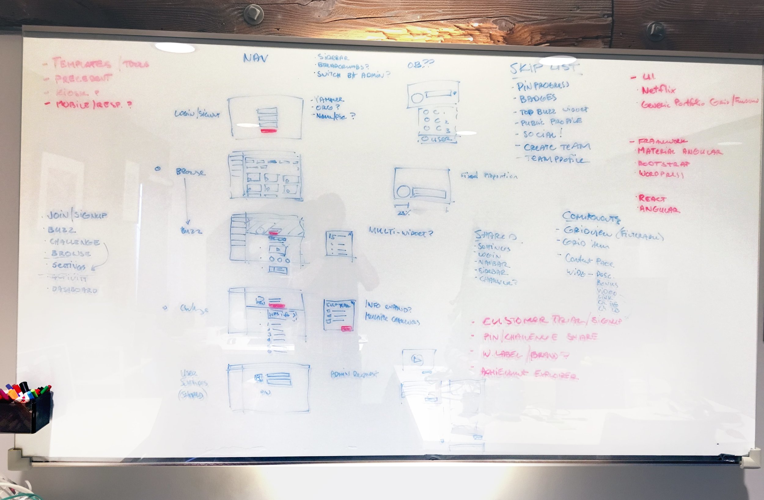
Team ideation on the whiteboard
Early wireframes
Mockup and prototypes in Adobe XD
Built Around Common Tasks
We learned from feedback that while many customers had similar lists of common tasks, there was no consensus on what was the most important. This led us to use a much flatter and wider hierarchy than the app, making the dashboard better suited to a larger range of tasks. The top of each major section typically includes a grid or table overview of the content of that section. This makes the organization more intuitive, as well as helps customers plan ahead, a major concern the dashboard aimed to address.
High Level Overviews
Our research found that a large subset of administrators that would be using the dashboard, would rarely, or never, use the app. These administrators cared most about monitoring their organization's use of the app. For this reason, the higher level overviews are deliberately clean to make it easier to show a greater breadth of information.
Familiar Editing
A different subset cared much more about customizing the app's content, like Actions, Challenges and Notifications. These administrators were much more likely to be app users themselves. With that in mind, the deeper views use WYSIWYG editing patterns. This was an intuitive choice because it is more familiar, taking design patterns from the app. It also gives the administrator more confidence in understanding how their edits will appear in the app.
Results
25%
Reduction in time spent managing customer content.
When launched, we had created a powerful tool for customers to gain control over their organizations in real-time. We also accomplished our goal of taking a task that took as much as 25% of our concierge's time, and essentially removing it. This saved a precious resource, allowing the customer support team to focus on other more important tasks.


